NBC News Digital: How We Built CNBC Select
A story in six sprints, 2019
When we wake up in the morning, what drives us at CNBC Digital is the compulsion to help our users get informed when and where they need it, so that they can act upon their financial goals.
We think about this all. the. time.
So when it comes to helping CNBC’s audience deepen their relationship with money, we build and champion experiences that genuinely help them take the next steps on their financial journey. It’s a mission much easier said than done, but we believe in crafting products that empower them to make truly meaningful decisions in the moment, in a way that communicates trust, authority and action. This is what keeps us up at night, but also gets us up early every day.
So when we got thinking about how we could drive incremental digital revenue for the business with this perspective in mind, in a way that would allow us to explore new revenue streams, and deliberately build new muscles for the organization in parallel with augmenting financial confidence in our users, we got thinking a lot about helpfulness, service journalism, and how that might connect with affiliate revenue.
CNBC Web Products consists of four teams. Growth, who are immersed in acquisition, optimization, search, social and a host of other ways to leverage and build upon our reach. Engagement, who drive at deepening the relationship with the user, building habits, and think a lot about how we can help users get caught up on the markets as quickly as possible throughout the day. Monetization, who make sure that all of those Growth and Engagement efforts are making sense from the commercial side, especially around sponsorships and video, and finally we have Multiverse, who act as our Special Projects team.
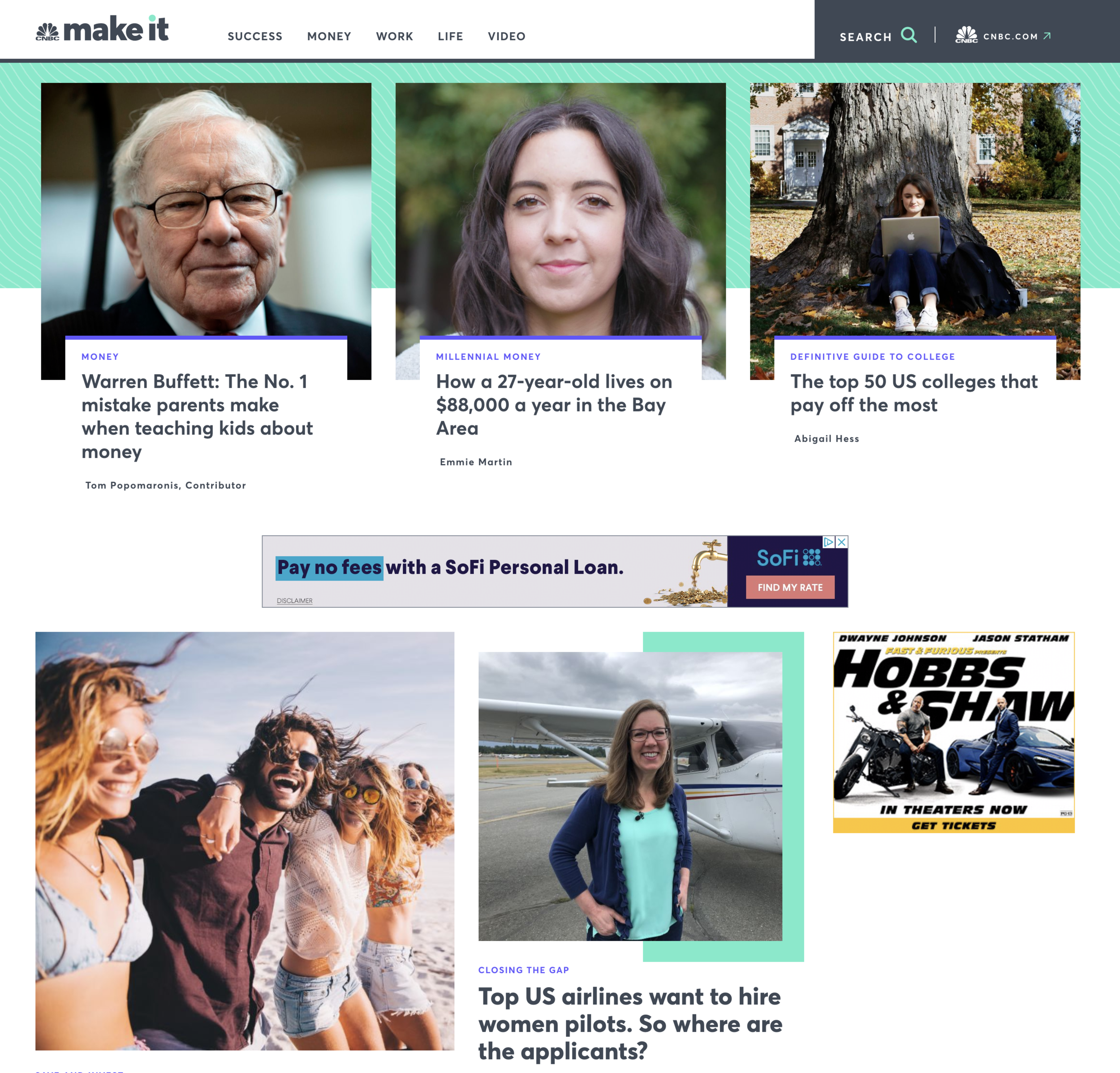
Earlier this year, Multiverse had built out our new partnership with Acorns, and have a number of products in their portfolio, including MakeIt, Deal or No Deal, and The Warren Buffet Archive. Their passion is to make new expressions of our web presence an innovative, essential part of our users’ experience, and in many ways they act as pioneers for new business hypotheses, new ways of building, and how CNBC Digital thinks about the future.
When Multiverse started to think about building an affiliate revenue product based on leverage CNBC’s existing audience, and proving out an additional, incremental digital revenue stream, we partnered very closely with the Business Development group to understand the revenue case, what success looked like, and what kinds of user problems we’d really need to solve for. The business hypothesis is that CNBC users will trust us to help them with personal finance decisions, and that we can grow incremental revenue as a result. We’d seen tremendous success in being able to scale MakeIt’s audience based on tactical, practical service journalism, and by partnering with banks and card issuers, we wanted to bring that level of engagement to credit card recommendations.
The premise is simple. When a CNBC user signs up for a credit card with one of our card issuer partners, and when the origin can be attributed back to our product, we receive an affiliate payment. We also knew that we wanted to make sure we took advantage of the seasonal increase in credit card spending in the fourth quarter, so we’d set a hard deadline of an October 1st launch. This gave us four months to build and ship everything.
Our teams had a tremendous opportunity to make a meaningful, long lasting impact upon the business by building something new that truly helps both our internal and external users.
The first thing we did was to time box out a two week user research sprint with our Design and UX team, to understand the competitive feature set, but to also help us understand the key pieces of functionality that would be most important to those users looking to get a new credit card. What we heard loud and clear was that the credit card process is extremely ‘me’ centric for a reader. It’s often a personal decision based on a life moment, and almost exclusively begins with an online search.
Out of this process we established a set of design principles, centered around the notions of establishing trust through choice, and making sure that our expertise empowers users in a way that prioritizes guidance over declarations, ensuring efficiency over aesthetics, or in other words, making sure our user interface gets out of the users’ way, with an overarching desire to keep everything as clear and simple as possible, but allowing readers to go deeper when they want to.
We circulated this set of principles with our stakeholders, and began a short design sprint to be able to start visualizing everything. Once the designs had reached a critical mass, we held an all-hands meeting for everyone on the Product floor. The product team, engineering, ads and analytics, project management, design, stakeholders, architecture, QA, infrastructure, customer service, operations, the mobile teams and many more. Given that the project had a strictly defined, clearly time boxed outcome, we needed to ensure alignment with everyone on the floor who was going to touch this project understood why we were doing this, what success looked like, and appreciated the urgency around what their respective pieces of the pie looked like. We served snacks, and the event sparked a healthy discussion around ensuring not just effective delivery on the technical side, but also how our work would be successful for both users and the business.
We clearly defined not just what success looked like, but also what success didn’t look like. Not launching on time, having the product perceived as advertising, low traffic or conversion rates, complicated content management, or just a general apathy from users were all on the table as problems we needed to solve. We were also incredibly clear about what we didn’t know at the time. We knew that maximizing conversion would be key to generating revenue, and that this was strongly dependent upon driving audience through search. The resulting conversion tracking was the key to measuring success, but we didn’t know how we were going to be able to insert credit card modules into a content management system engineered for market-driven journalism. There was a lot of unknowns around how to work with card issuers, what the compliance review cycle would look like, and how we’d break down all the cross-functional dependencies along the way.
So that’s where we started. At the beginning of the first sprint, we scoped all of the front end and infrastructure work that needed to happen, and proactively flagged as many of the cross-functional dependencies early and often. We began to work even closer with our compliance and business development partners in parallel with a new editorial team to lock in disclaimer placements and understand the compliance review process with the card issuers. We talked a lot about lists, helpfulness, headlines and clicks.
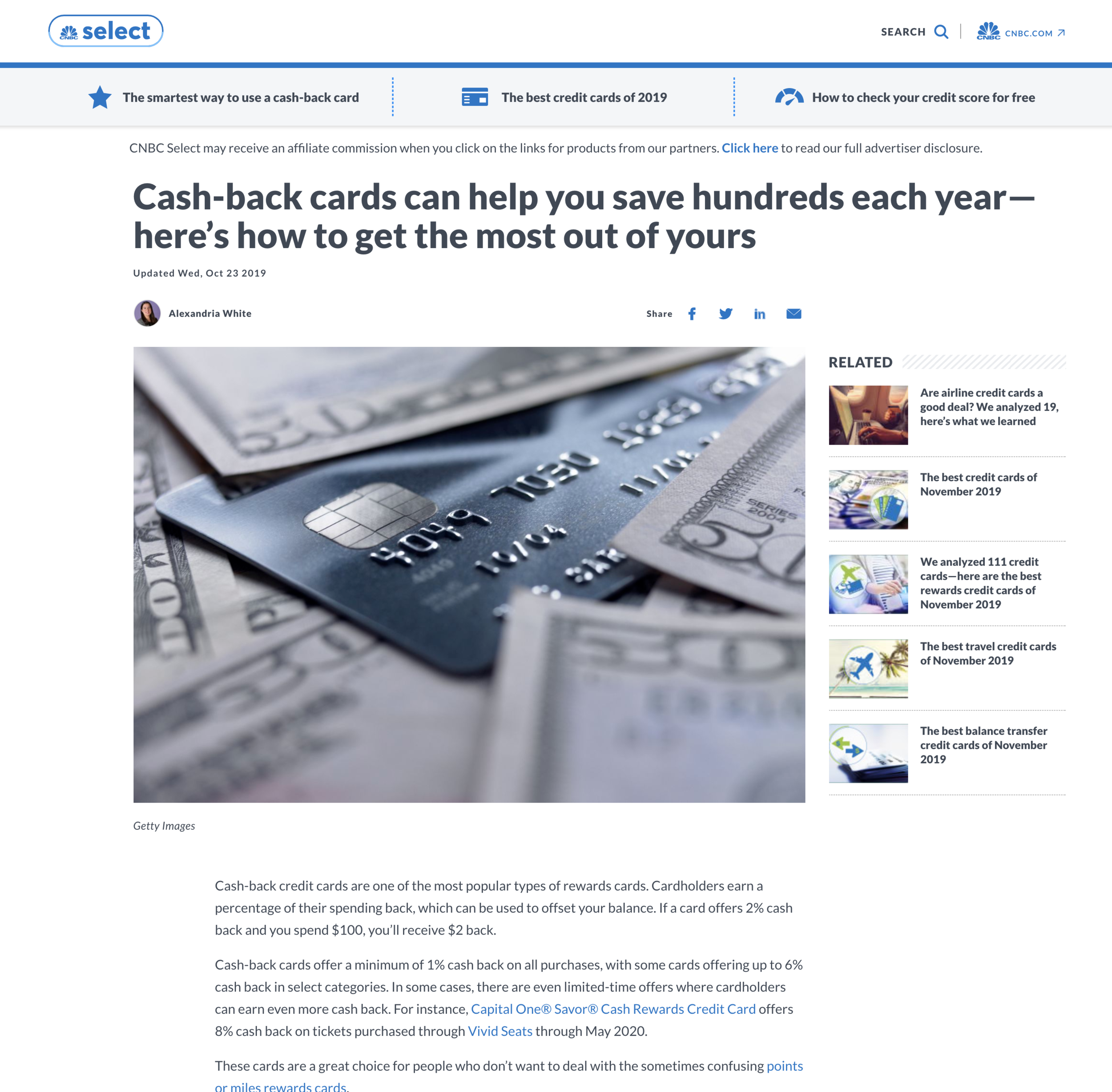
We also needed a name. After a few creative twists and turns with our marketing department, we settled on CNBC Select.
The most important step we took was to meet as a team, every day at 9.30am. The core team of Product, Project, QA, Engineering and Infrastructure started their day with a clear sense of what needed to move, where we were in the process, and who needed to be doing what. We’d defined a clear roadmap that worked back from the launch date, and where we could, we’d built in buffers for as many of the unknowns as we could.
Our Project lead had created a visual timeline for us to use as a tool to line up all of the cross-functional dependencies, and we got to work. No-one was allowed to be blocked.
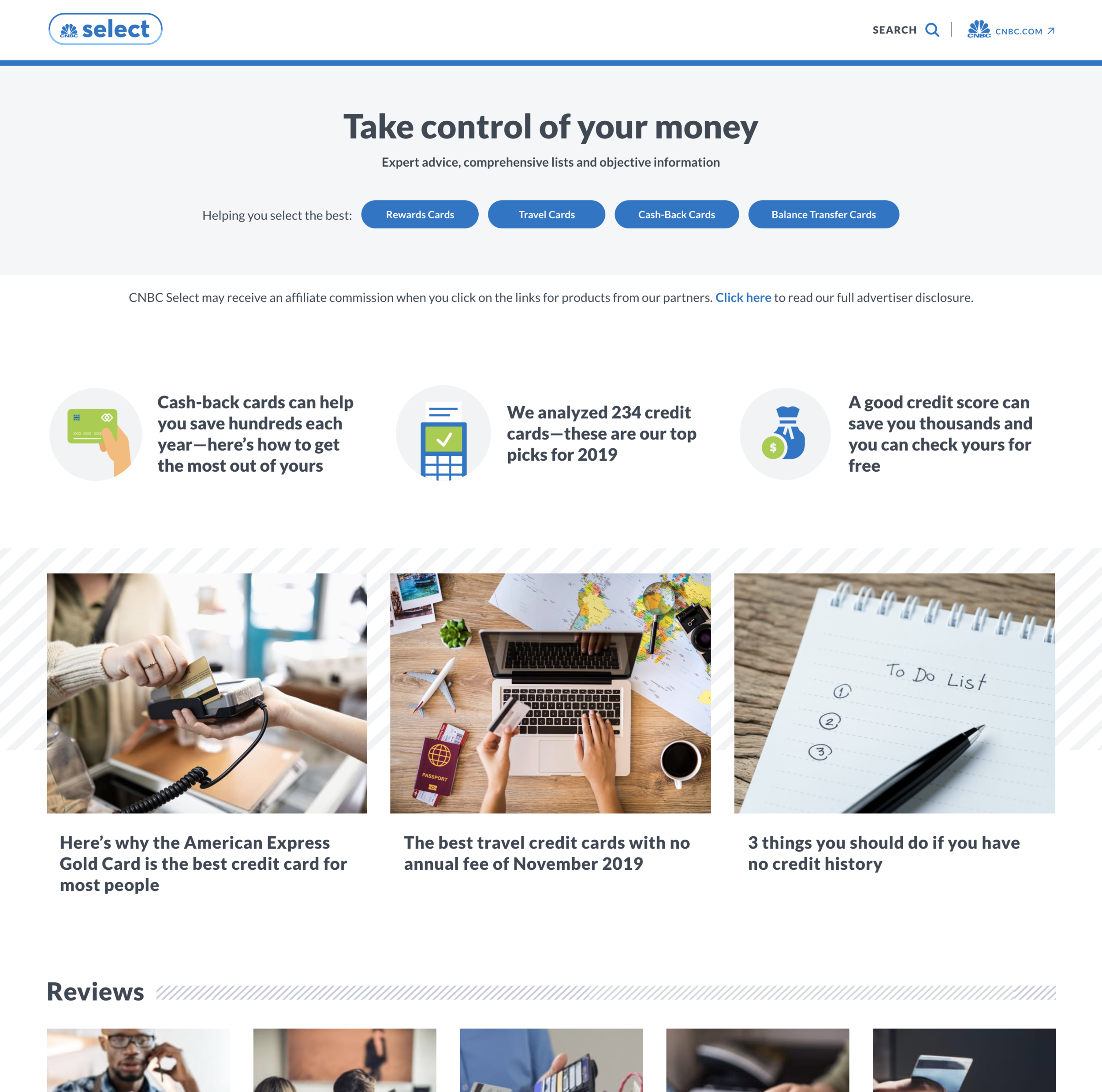
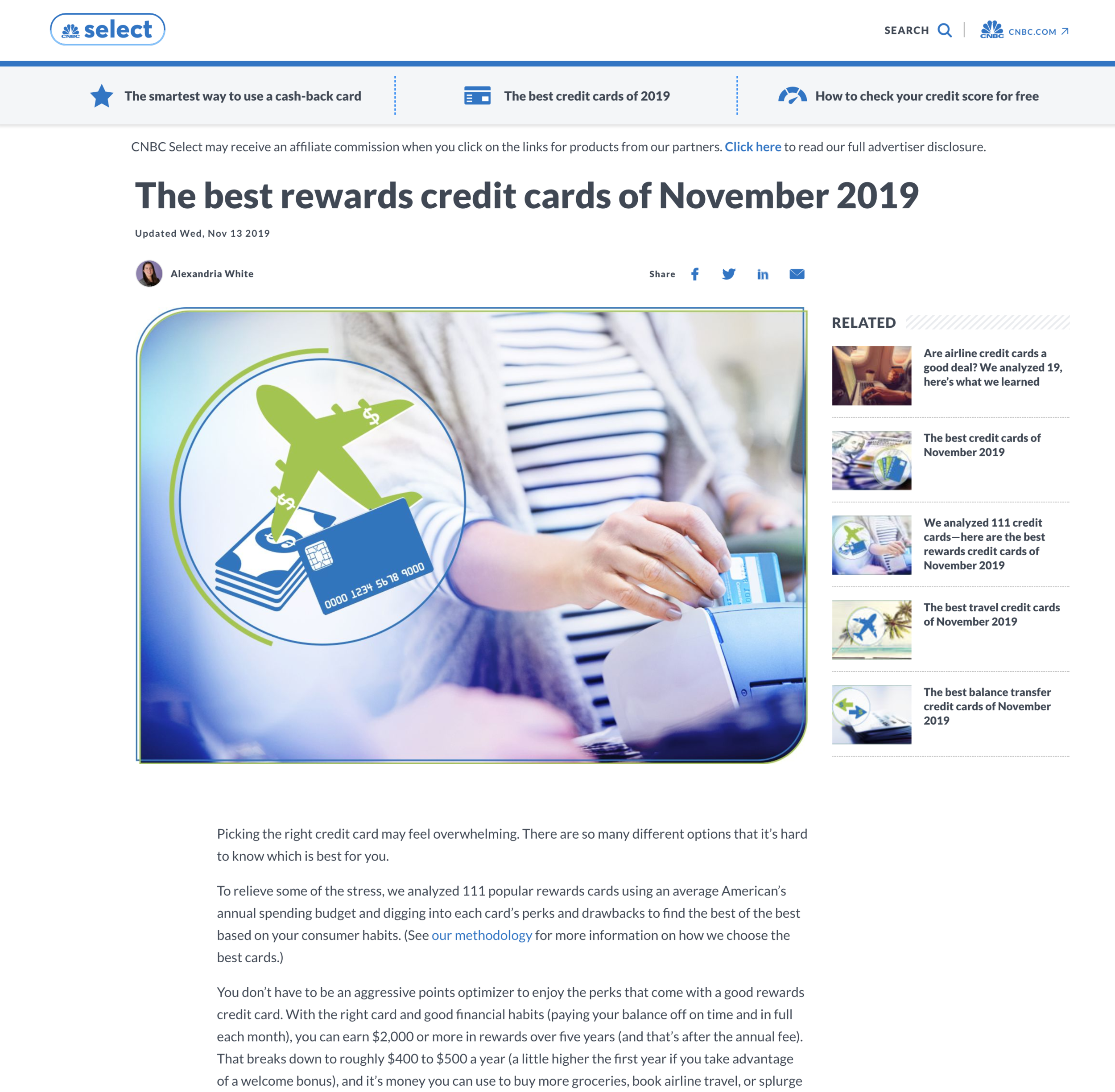
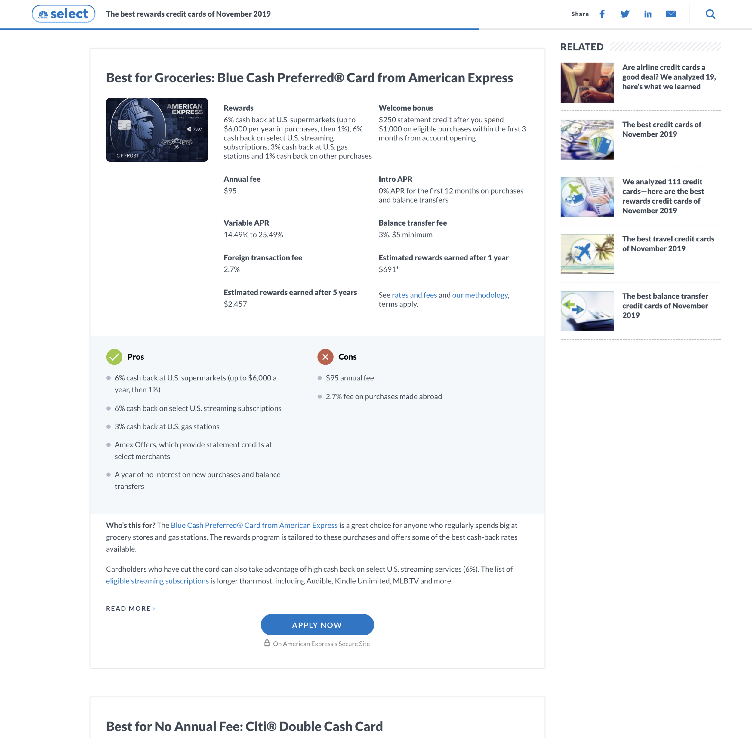
We got ticketing, creating clear, comprehensive, visual tasks across all elements of all the pages, and broke those pages up into individual functional modules with their own specifications. We knew how the navigation needed to work, what social sharing meant, how related article recommendations were specified, and most importantly, what our new credit card modules had to do. As we did this, we were able to assemble a clear view on what the full arc of our three month, six sprint, twelve week project would look like. It allowed us to break up the project into manageable, well defined milestones that we could also regularly share with our internal teams. Sprint one was for the homepage, sprint two an article page, sprint three the credit card module, sprint four the search experience and disclaimer pages, and so on.
This process facilitated being able to add milestones and check-ins with our stakeholders and the card issuers every two weeks, with clear benchmarks. This allowed our internal teams to feel momentum, and grow in confidence around the development process that our launch window was going to be hit comfortably. In parallel, we also met weekly with our expanded working team across editorial, business development, search and analytics to make sure that everything was still on course in terms of content development, card issuer conversations, analytics and reporting implementations, and the all-important search optimization.
By sprint three in August we were growing in confidence that we could not only hit the timeline, but actually perhaps even deliver early. It was important to show stakeholders our progress as often as possible, in whatever state the pages were at the time, and give them a growing sense of confidence that the product was evolving and improving, and we were particularly rigorous around ensuring that as much as possible was documented into our shared wiki.
Sprint five, at the beginning of September, was where everything came together. The content from the editorial team was starting to become available, our new credit card module had been realized by our CMS team and was starting to be populated by our compliance team, and the pages in the product were starting to really feel production ready. The big unknown continued to be how long the compliance process was going to take, but by proactively working with them to not only show them screenshots, but also give access to test environments where they could use the product behind a password-protected experience to really see where their content would appear, accelerated the process down to just three small items that needed to be address in the final sprint. We were ready.
But as with all product launches, you’re never ready, and there’s always the last mile to get through. We needed to make sure that everything was passing not just our own rigorous internal QA process, but also that of the card issuers as more were getting onboarded. We needed to make sure that our audience development plan was in place and working in parallel with all of our on-air and digital marketing initiatives. We needed to check that when a user clicked through and signed up for a credit card, that the transaction was being recorded accurately and that the revenue was being counted correctly. And we needed to make sure everyone understood the play-by-play of what a smooth product rollout consisted of.
As our 9.30am meetings knocked each one of these items down every day, we collectively felt a growing sense of confidence that when the business was ready to launch, so were we. A launch date of October 16th was set, just to finalize as many card issuer compliance items as possible, and everyone lined up their efforts in the newsroom and marketing departments on the audience development side in parallel. The launch cycle on the development side consisted of pushing live those final compliance items, adding CNBC Select traffic drivers to places around the site such as our global navigation, and removing the password protection from the product.
Since launch, it’s been incredible to see how the product has resonated so well with users, driving millions of page views in the first month alone, and how much positive feedback we’ve received from them in being able to be truly helpful in their decision-making process. Audience and revenue are growing, and internally we’ve often referred to how we built this as a precedent for being able to move fast, align with the business, and drive meaningful value to the organization. The product is proving effective, but how we built it has been the huge growth opportunity for CNBC Digital.
It was a tremendous learning experience, and most importantly, a lot of fun to work on. I’m extremely grateful to everyone at CNBC who worked on Select with us, and I can’t wait to see what we build together next.


